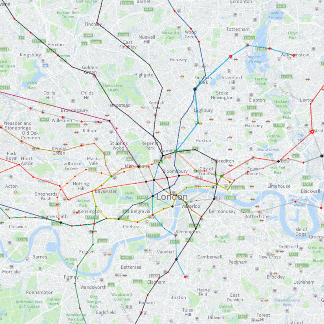
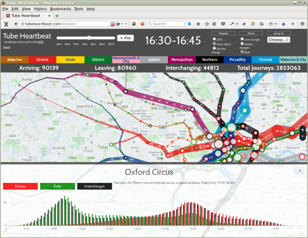
Oliver O'Brien, a Senior Research Associate at University College London (UCL), has created a wonderful visualisation of the volume of passengers traveling the London Underground on a typical workday. His Tube Heartbeat project builds on the outcomes of the TfL Rolling Origin and Destination Survey (RODS), which was made publicly available under the UK Open Government Licence (OGLv2). It shows the numbers entering and exiting each of the 268 stations and the numbers traveling each of the 762 links in between.

Tube Heartbeat features an interactive map that displays the swelling and shrinking of traffic in 15 minute intervals throughout the day, hence the name 'heartbeat'. Visitors can drill down to get the statistics of the individual stations: the number of entries, exits and interchanges.

Data visualisations
Oliver O'Brien works in the Geospatial Analytics and Computing Research Group (GSAC) at UCL's Department of Geography, and has a proven track record in data visualisations. The Tube Heartbeat visualisation uses the mapping engine of HERE, which also commissioned this project.

