How to use building blocks to create advanced custom pages
In order to add content to a collection or a solution, you must be either a member (you have joined the collection/solution), an author, a facilitator or an owner of that space.
This article will explore how to use building blocks to create content on the Interoperable Europe Portal. In particular, this feature is available on the creation of news, documents, and event items (also, custom pages – click here to discover more).
To get started with content creation, click the plus (+) icon at the top right side of the page and select, for example, “Add news”. (The building blocks are the same under each of the three content types: thus, this example can also be extended to the creation of events and documents on the Portal).

Add your “Headline”, “Short title” and “Abstract”.
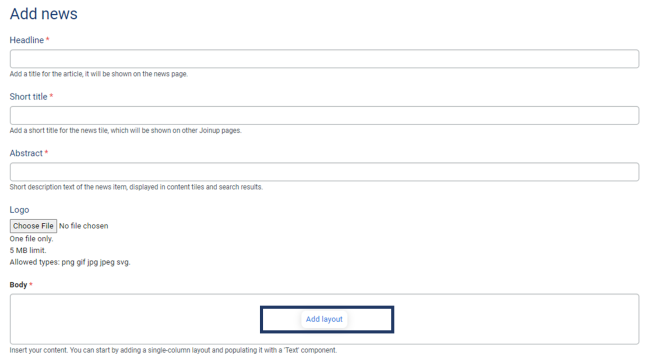
Then, under “Body” click on “Add layout”. Click on it and the list of the available components will appear. You can choose to add text, images and other unique components that work like building blocks in order to help you structure your custom page to your needs.
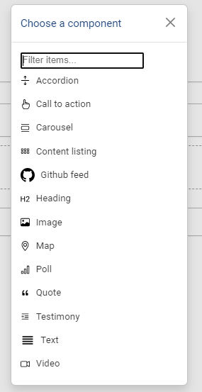
In the below table you can find a description and an example screenshot of each available component.
| Component | Description |
|---|---|
| Accordion | You can create an accordion by filling the “Item label” and body inside the accordion feature. Click on the “Add Accordion Item” to add more components to your accordion. 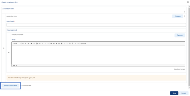
An example of an accordion with three components is shown in the screenshot below: 
|
| Call to Action | The Call to Action feature allows you to create a clickable button. Just add your landing page link in the URL field and the text for the button in the Link text field. 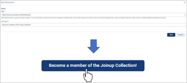
|
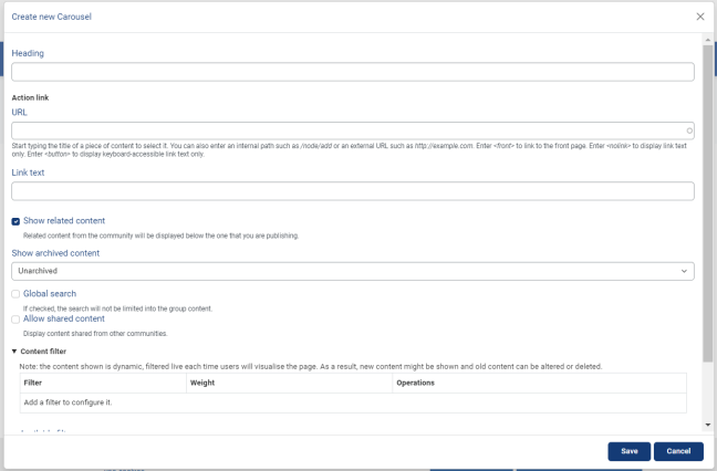
| Carousel | The carousel component lets you display a series of content items that rotate/slide through.
|
| Content Listing | This component allows you to create sections in custom pages that list the provided content. For example, you can create a content listing that shows only the Event items in your Collection/Solution. 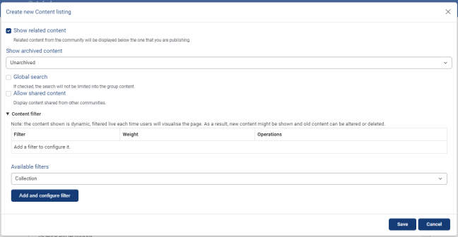
|
| Entity reference | An entity reference allows you to add a reference to a content item on Joinup in your custom page. This will add the referenced content item's image, title and link. See a screenshot of an entity reference result below: 
|
| Github feed | Add your Github feed to the custom page to show an overview of the latest activity from your GitHub's repository 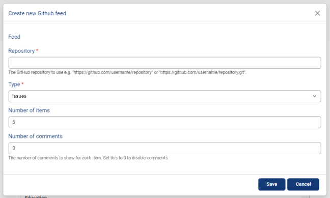
|
| Heading | Add your heading in the Heading text field and select the size of your heading by expanding the Heading level drop-down. 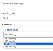
Move your heading block above another block (i.e. a text block) to give it a title. 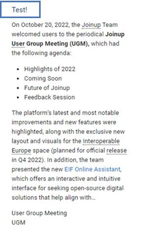
|
| Image | To add an image in your custom page select the image component. Locate the "Choose File" button, click on it, find your image and wait for it to upload. When the image is successfully uploaded, add a text describing it in the "Alternative text" field. The "Visibility" options allow for further customisation of the page, depending on your needs. 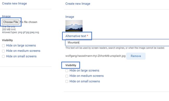
By adding images, you can enrich your page and make content more attractive to users. 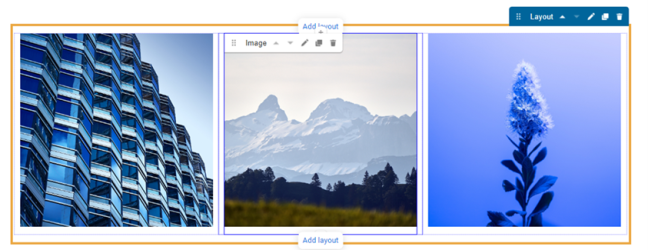
|
| Map | By selecting the Map component, a single field will appear in which you need to add a JSON formatted code. If you do not have a JSON code ready and do not know how to create one then click the Basic Map (BMAP) Wizzard link. 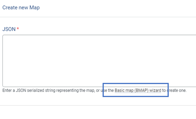
You will be directed to a webpage, dedicated on helping users create interactive maps. Here you can find a detailed how-to, that explains the BMA wizard tool. In a few easy steps you can create and customise your map, adding it to your custom Joinup page. 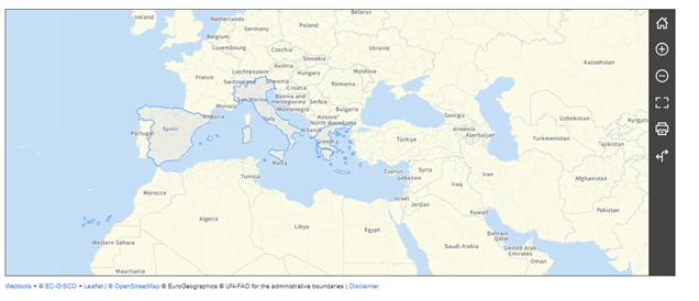
|
| Poll | You can create Polls for your users to vote and express their opinion. 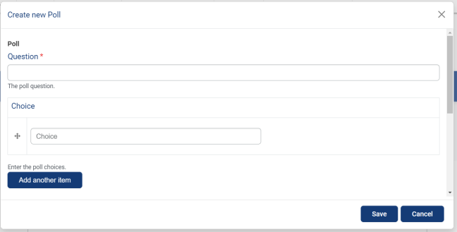
|
| Quote | The Quote component allows you to make text stand out. Just add the text you want to highlight (i.e. a quote) in the Quote field. 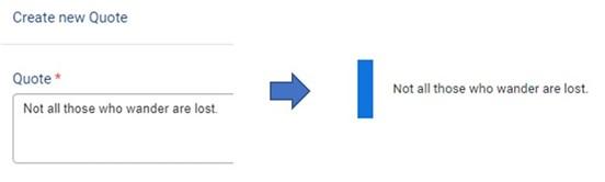
|
| Testimony | The testimony component allows you to share a person’s testimony, along with their name, image and biography. You can also add the testimony’s source. 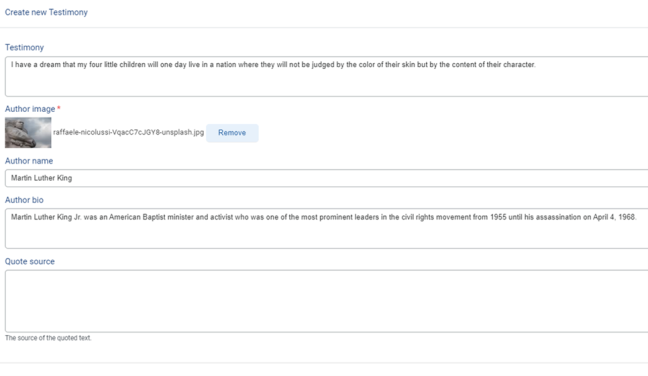
See below an example of how a testimony looks like: 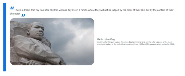
|
| Text | The text component allows you to add text on your page. While creating text, there are a few formatting options available. You can gain more information on text formats by clicking on the “About text formats” link, below the text field. 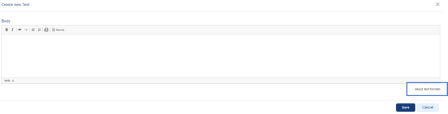
Keep in mind that the Heading styles are not part anymore of the Text component, but are now a separate component. Refer back to the Heading component for more information. In the example below, we added text under the images we created before: 
|
| Video | The video component allows you to embed a video in your custom page by inserting its URL. 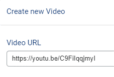
The video thumbnail will appear directly on your page. 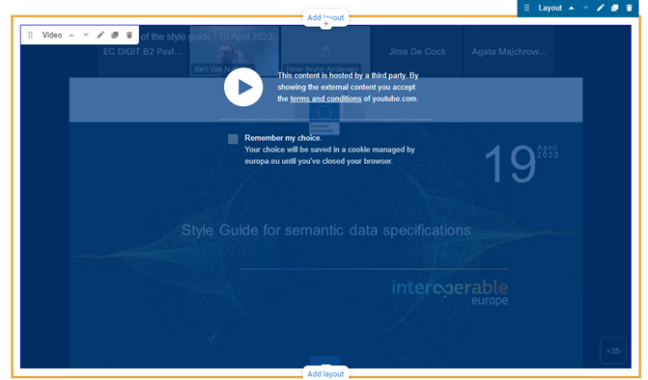
|
You can customise your page using the available features and components mentioned above. As good a practice, it is preferable to add Logo/image to your custom page, which will displayed in other areas of Joinup (i.e. in search results, on the Home Page etc.).
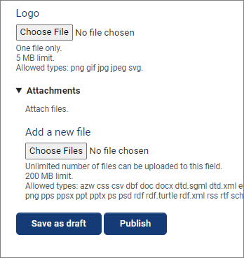
TIP: Do not directly publish your page. Save it as draft to see the overall result and make any changes needed before you go live with it.